“Change is inevitable. Adapt.”
I honestly can’t remember where I originally heard this, but it’s stuck with me for years. This phrase is one of our guiding principles here at Graph Paper Press and it helps to explain the reasoning behind our most recent site redesign.
Becoming Responsive
More and more people access our site from different devices with different screen sizes (iPad, iPhone, etc.). iPads already account for almost 3% of our site traffic, which is more than users visiting our site using IE 6 & 7 combined. That is significant and will only continue to grow.
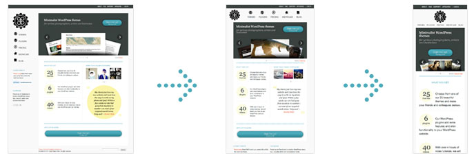
“Responsive web design” was a term coined by Ethan Marcotte in mid 2010. In a nutshell, responsive web design is a design philosophy that suggests that web sites should respond to the user’s behavior and environment based on screen size, platform and orientation. For example: When I visit our new site on my 15″ laptop, it displays at 1015 pixels wide with a left-hand sidebar. When I visit it on my iPad, we lose the sidebar and move the navigation to the top, beneath the logo. When I visit it on my iPhone, we lose the horizontal columns and some icons and make the site a fluid width. Resize your browser window to see how responsive web design works.
What Responsive Web Design Means to You
Technology evolves at a rapid pace and the number of new devices and screen sizes grows exponentially each year. You have a choice: You can build an iPhone-specific website, an iPad specific website and so on OR build one website that responds and adapts to the device that is loading it, making your content more accessible to your readers. Thankfully, we’re about to do all of this for you.
Making Our WordPress Themes Responsive
We’ve secretly been hard at work revamping our Base theme framework and its child themes to become responsive WordPress themes. Like the new Graph Paper Press redesign, these themes will also all support HTML5 and more advanced CSS3 techniques.
Checkout this video of our Base theme responding to changing screen sizes (being responsive):
It goes without saying that all our new themes will all be responsive. These new responsive themes will drop within the next month.
A Responsive Coupon Code
In anticipation of our upcoming responsive WordPress theme releases, we have 100 coupons for 30% off our Annual and Developer subscriptions. Use this code on the sign up page: RESPONSIVE
While our new responsive themes have yet to be released, why not take advantage of the discount today and be one of the first to download the new themes once they arrive.
Responsive Web Design Resources
- Responsive Web Design
- Media Queries for Standard Devices
- Responsive Fluid Grid Framework
- Pseudo Class Selectors
- Responsive Web Design Tools and Techniques
Enjoy!
