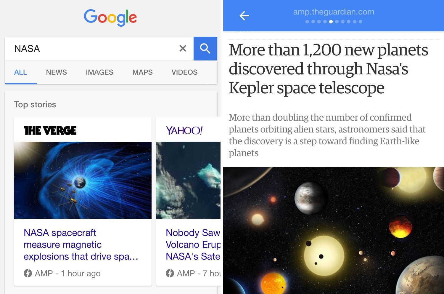
Back in October 2015, Google announced the launch of a project that may change the internet forever. The Accelerated Mobile Pages (AMP) project makes static pages and images load faster than ever before, and despite the youth of the project, big names like Pinterest, WordPress, and Twitter have all voiced their support.
For photography website owners, the launch of AMP was as exciting as it was intimidating. After all, adapting existing websites to new technology is often difficult.
Wasting time, however, would prove fatal. It’s been nearly a year, and there are plenty of tools and tutorials about AMP. The first step towards switching gears is understanding what AMP is, and why you need it powering your site.
We will explore the benefits and potential pitfalls of AMP in this abbreviated tutorial, as well as provide resources for allowing your site to run AMP-compliant code.
A Brief Look at Accelerated Mobile Pages
The Accelerated Mobile Pages (AMP) Project is an open-source initiative, enabling publishers to create content that’s optimized to load super fast. Here’s a video Google put together to introduce AMP to the masses:
https://www.youtube.com/watch?v=WrpkFROqR0Q
Accelerated Mobile Pages work just like any other HTML page on the web, but with all the clunky extras stripped away, leaving behind some very lightweight code.
AMP-compatible pages have already started rolling out, and some of the world’s biggest publishers are already on board:
For more information on AMP, including technical tutorials, check out the AMP Project website.
Are Accelerated Mobile Pages Replacing Responsive Design?
The short answer is no.
Responsive design and Accelerated Mobile Pages are two separate approaches to mobile web design, and they can actually work in tandem.
Whereas responsive design is focused more on the aesthetics of a web page, ensuring page elements load correctly and tidily across all screen sizes, AMP-compatible pages care more about speed and delivery.
How Photography Websites Can Benefit From Accelerated Mobile Pages
Accelerated Mobile Pages provide speed benefits to your mobile users, and because they can deliver images just as quickly as other content, it will be specifically photographers and image-heavy websites will benefit from a sizeable speedup. This is good news, speed is no longer just a luxury – it’s a necessity.
According to KISSmetrics, 40% of website visitors abandon a website that takes three or more seconds to load. With that in mind, implementing AMP will allow you to present your imagery faster, and encourage your website visitors will stick around. They’ll see more content, and the longer they stay on your site, the more likely it is that they will convert into paying customers.
Should Photography Websites Be Worried?
As a photography website owner, the only thing you need to worry about is falling behind.
Not long ago, Google started penalizing websites without responsive design by lowering their search engine rankings, and started rewarding websites that were responsive with higher rankings. And although AMP is still fairly new, Google is likely to start favoring AMP-compatible websites in the future. After all, page loading times already play a significant role in search engine optimization.
What Should Photography Websites Do Next?
All that being said, now is the time for photography websites to get ahead of the competition by implementing Accelerated Mobile Pages on their websites. When you adapt to this new web technology, you know that you will offer a far superior user experience compared to your competitors.
If you possess a fair amount of coding ability, you can get everything you need from the AMP website and the AMP GitHub page. However, WordPress sites have a simpler option.
WordPress and Accelerated Mobile Pages
WordPress-powered websites are at an advantage, as Automattic’s AMP plugin does all the heavy lifting. When you install and activate the plugin, it generates the required AMP-compatible pages. After you install the AMP plugin you can see these pages in action by adding “/amp/” to the end of any of your post URLs.
For now, the plugin comes with no styling options, and uses only your website’s logo to give your content any visual punch. However, there are other plugins available, such as Glue for Yoast SEO & AMP, that provide this functionality if you need it.
Conclusion
Accelerated Mobile Pages are going to change the way we experience the internet on mobile devices. The benefits to the end user (i.e. your paying customers) are vast even if it seems like a restrictive platform. The objective any site is to showcase the content, and mobile users are surging ahead as a major portion of internet traffic is done from smart phones and tablets.
In order to start integrating AMP into your website you should review the AMP website for information, or get Automattic’s AMP plugin to do most of the hard work for you within WordPress.
Are you excited by the advent of Accelerated Mobile Pages, and do you see it benefitting your business? Tell us more in the comments section below!
Image credit: unsplash.


Leave a Reply